Product design · Fraud & Risk · Piramal Finance

I helped FCU teams make more informed fraud investigation decisions with AI

I redesigned the sampling experience to help FCU teams use AI insights alongside case information to identify the right cases for investigation and make more informed decisions.

My roleResearch, IA, interaction, handoff
SurfaceParakh — the FCU investigation platform
UsersSamplers, agencies, branch managers
StatusDesign signed off · in engineering
Bala at his laptop

“Hello, I’m Bala. I work as a Sampler for the Fraud Control Unit (FCU) team.
I work with three other colleagues, and we all report to our manager, Hemanth.”
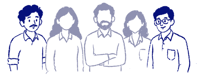
The FCU team

The FCU team at Piramal Finance conducts all fraud investigations.

Bala reading a document

“My work as a Sampler is to review the documents received from the Sales team
for every case, one by one.”

Sample, Screen and Query

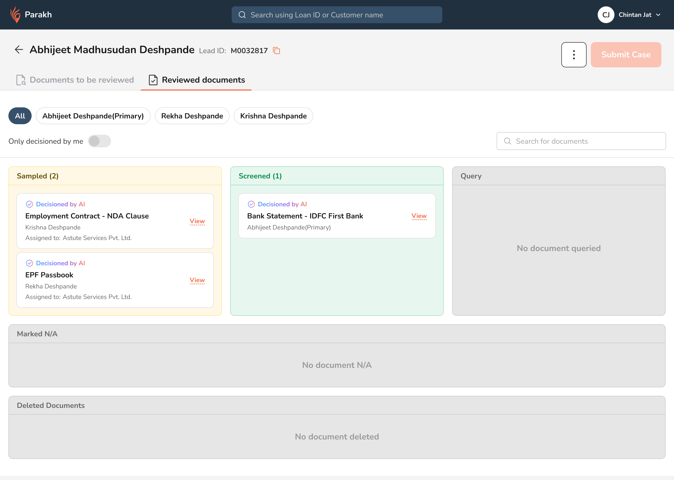
“I review them and mark each document as either ‘Sample’ if it requires further investigation, ‘Screen’ if everything looks good,
or ‘Query’ if I need more information.”

Suresh, the vendor

“For all the documents marked as ‘Sample’, the case moves
to my assigned vendor, Suresh.”

Suspect Fraud, Negative, Refer, Positive

He conducts further on-field investigations and comes back with one of four outcomes: ‘Suspect Fraud’ if he finds evidence of fraud, ‘Negative’ if the investigation has no conclusive findings, ‘Refer’ if the case needs another round of investigation, or ‘Positive’ if everything looks good.

Hemanth, the manager

“The case then moves to my manager’s tray. Hemanth reviews all the findings, sends back any documents that need to be re-checked, and finally submits the case to the Credit team.”
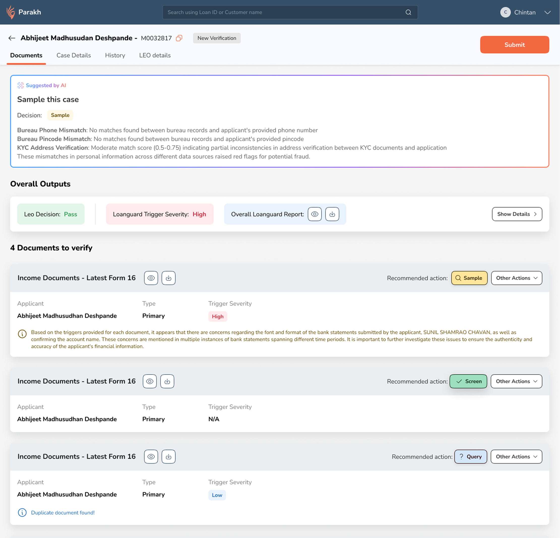
The screen which Bala worked on looked like this,

The screen Bala worked on

The legacy Parakh sampler screen
01LEO (Model) Details has a different tab!
02Overall case suggestion, not linking to individual docs. How do I proceed with this information?
03Conflicting decision points coming from different engines.
04There could be many documents in my view which makes decision making difficult
05Loanguard is suggesting to sample but there is no co-relation with the document
06Documents are not viewed outright but have to be previewed separately.

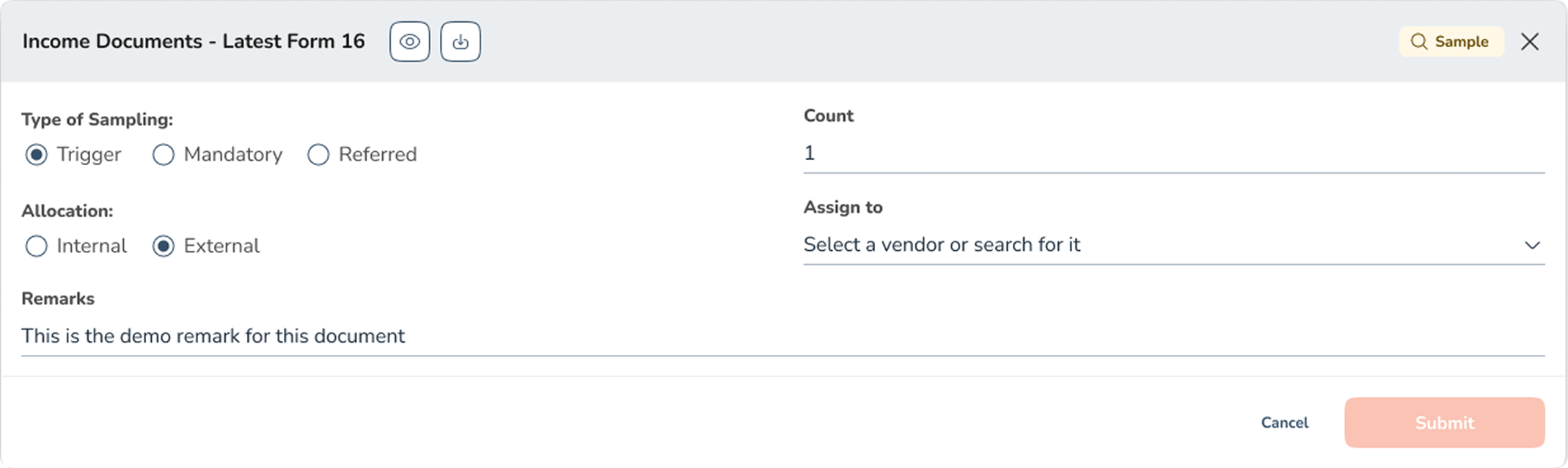
If Bala clicked on the sample button, a form as such would appear.

The sampling form that opened inside a document row

Here, there are too many things demanding for Bala’s attention.

  1. First he has to go through the full list of documents and then pick documents one by one and work them
  2. Next there are essentially 4 intelligent systems giving different outputs, which might be conflicting in nature.
  3. Lastly when Bala is working on a document he has to open the preview separately and every time. Which is a chore.
Leoprofile & document triggers
Prismdocument tampering
Loanguarddocument tampering
Hunterbehavioural & network fraud
Bala

Essentially, there are Four brains,
and One forehead doing the joining.

Every 100 cases that reach the fraud unit

15 get investigated. About 2 come back as fraud.

Each square is one case arriving at the fraud unit

Investigated, fraud found Investigated, came back clean Checked at the desk, never investigated

What this does is, hinder the quality of the output produced by the FCU team.

They miss out on actually investigating the cases that are worth it.

A different question, counted differently

Of 100 frauds that only surfaced after the money went out, how many had been investigated first?

Today23 investigated · 77 went out without one
Investigated before disbursal Not investigated before disbursal

The elephant in the room was too big to be hidden.

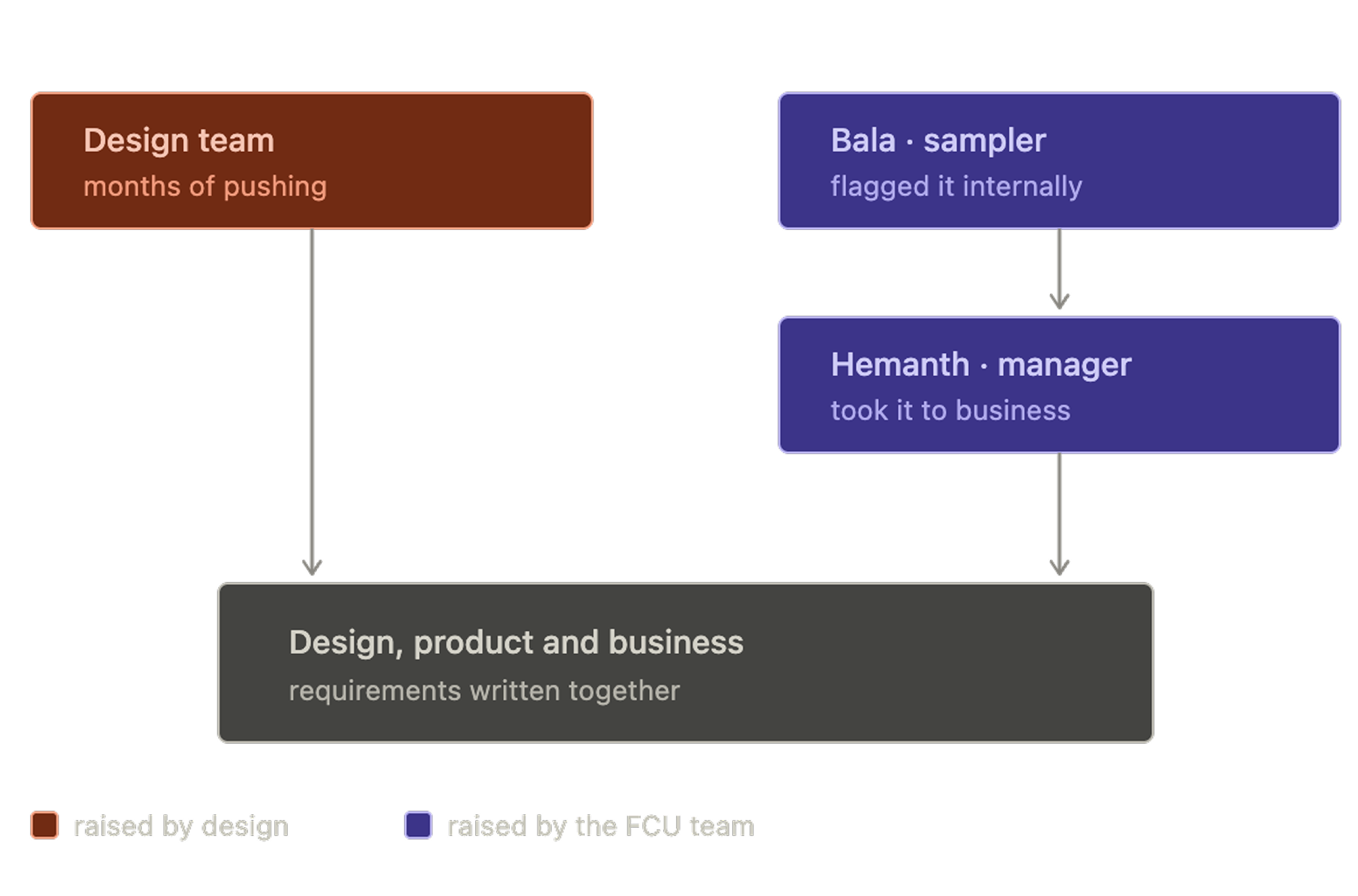
Design pushed for months; Bala flagged it internally and Hemanth took it to business; design, product and business then wrote the requirements together

After months of pushing from our side (design) and finally hearing the complaints from the FCU team and business impact, the new requirements were formulated based on the data we had.

The overall unanimous decision was to create one AI engine to power all decisions based on all the inputs we had for all the documents and the case.

Exploration

Initial Ideas

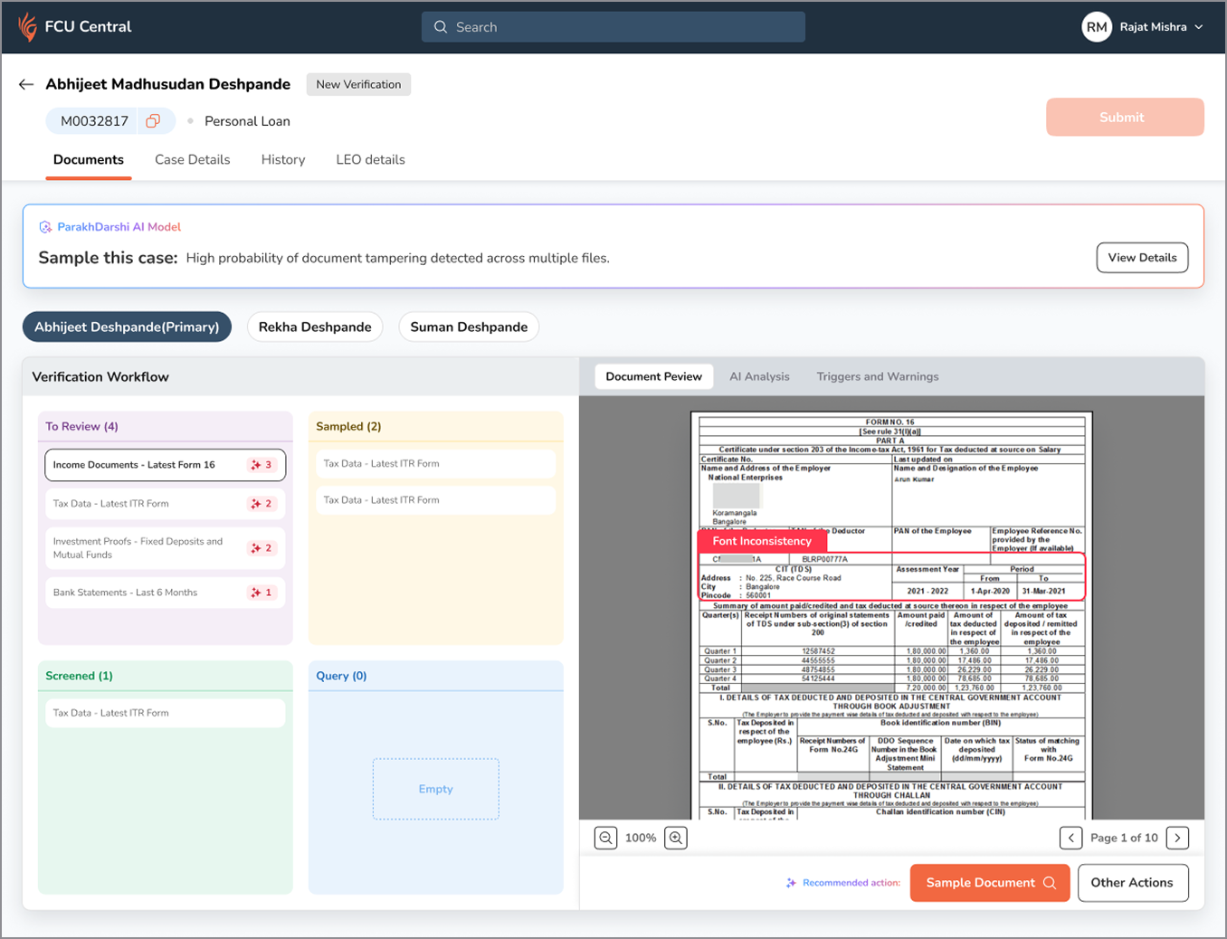
The first high level iteration was drafted on Figma itself, without the use of any AI tools. This exercise was done to help create a fresh dump of ideas that would not be diluted by AI directions.

Here ‘To review’ documents would be filled and can be viewed by clicking and opening them at the right hand side panel.

Although this freed up a lot of complexity off the screen, it did not work well. The issue of selecting between documents were still there and if one document had multiple triggers it was not easy to move between them.

Killed after one round. But helped moving forward.

First iteration — verification workflow columns with a document preview panel

For the next version, we fixated on quality. The user focuses on one document and it’s triggers at a time

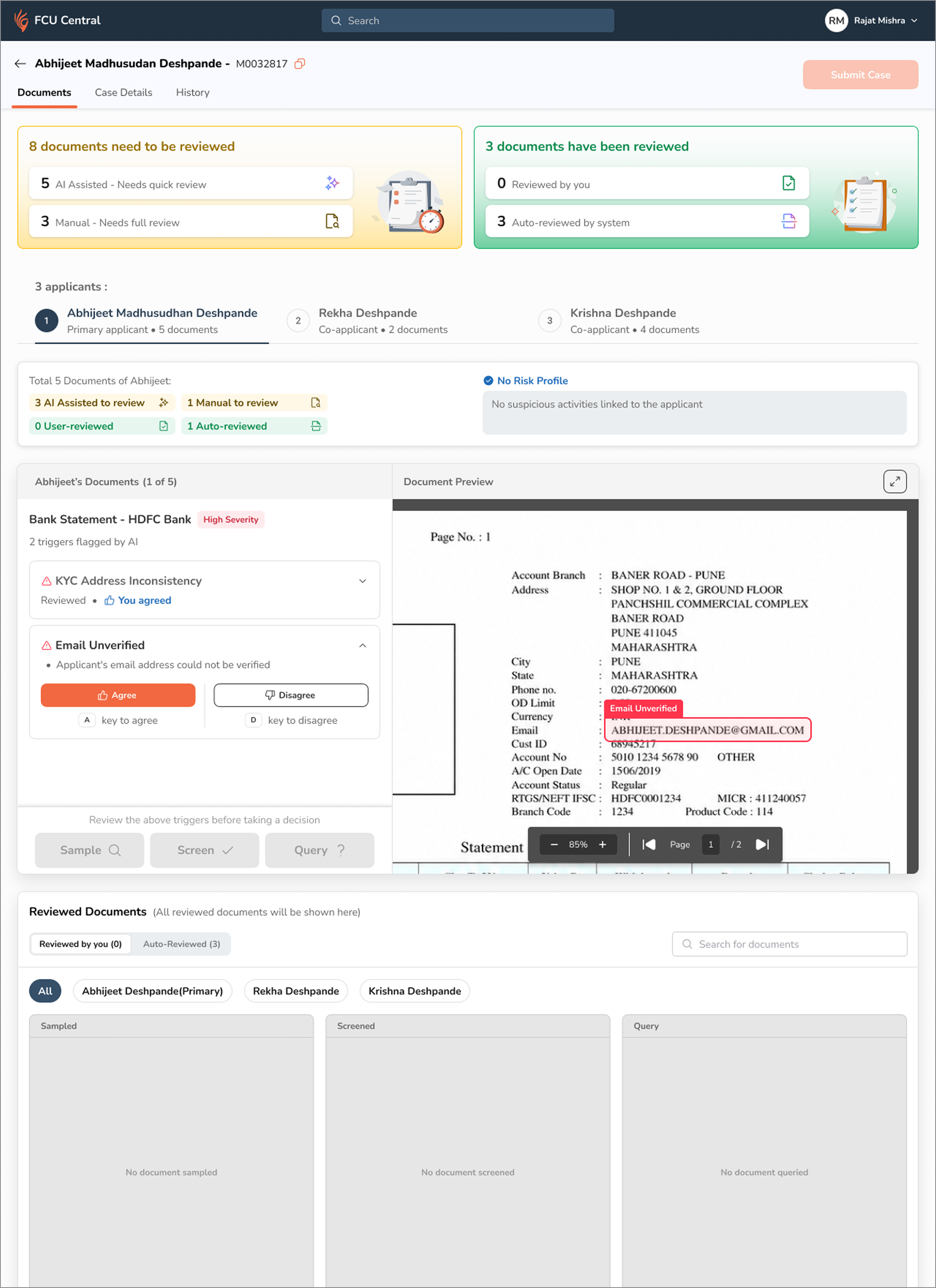
Iteration two

Second iteration of the sampler screen
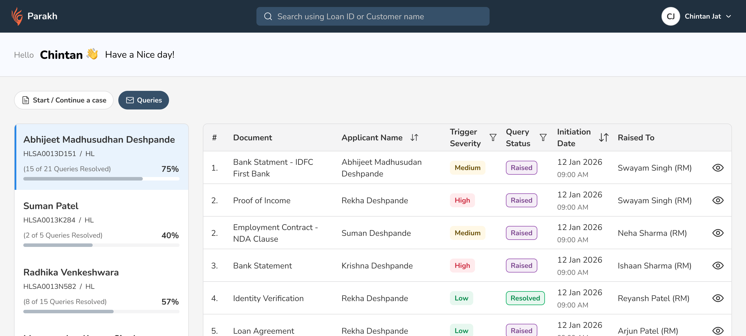
01Introduced to be reviewed and reviewed section with sub-sections
02Applicant details were re-designed
03The high level details tied down to the applicant level
04Bala can either agree or disagree with a trigger
05Bala can now click and select and trigger while highlighting the issue on the document on the right. Gives more context and makes decision making easier
06When a document is reviewed it moves to either of the 3 bucket

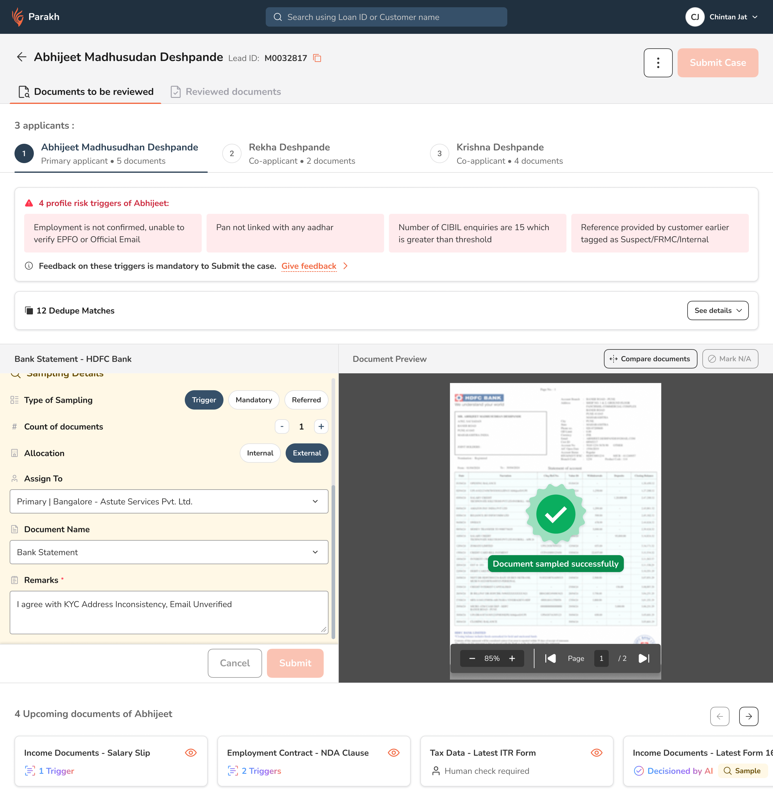
This was a much improved design, and while it had a lot of positives like disguising mandatory the feedback inside the triggers. We added keyboard shortcuts as per the usage pattern of our users etc; there were a lot of negatives as well. The user again had too much to think and focus on and we knew that we had almost cracked the design with our hero section.

Another round of ideating and almost there…

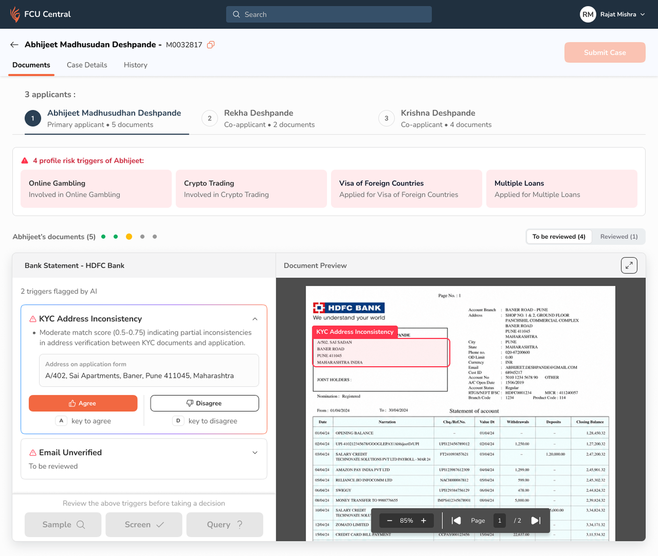
Iteration three

Third iteration of the sampler screen
01Profile triggers introduced to give more context about the applicant.
02New indicator dots introduced to show how many more documents are to come
03Move the reviewed tab inside

This iteration was closest to the final one. We took feedback from the users and they liked it a lot. They had a few demands through. They wanted to know which documents are upcoming next, so we needed to work for that instead of just using indicator dots. We also realised that the tab below the applicant’s had lost its importance so we moved it inside.

What we shipped

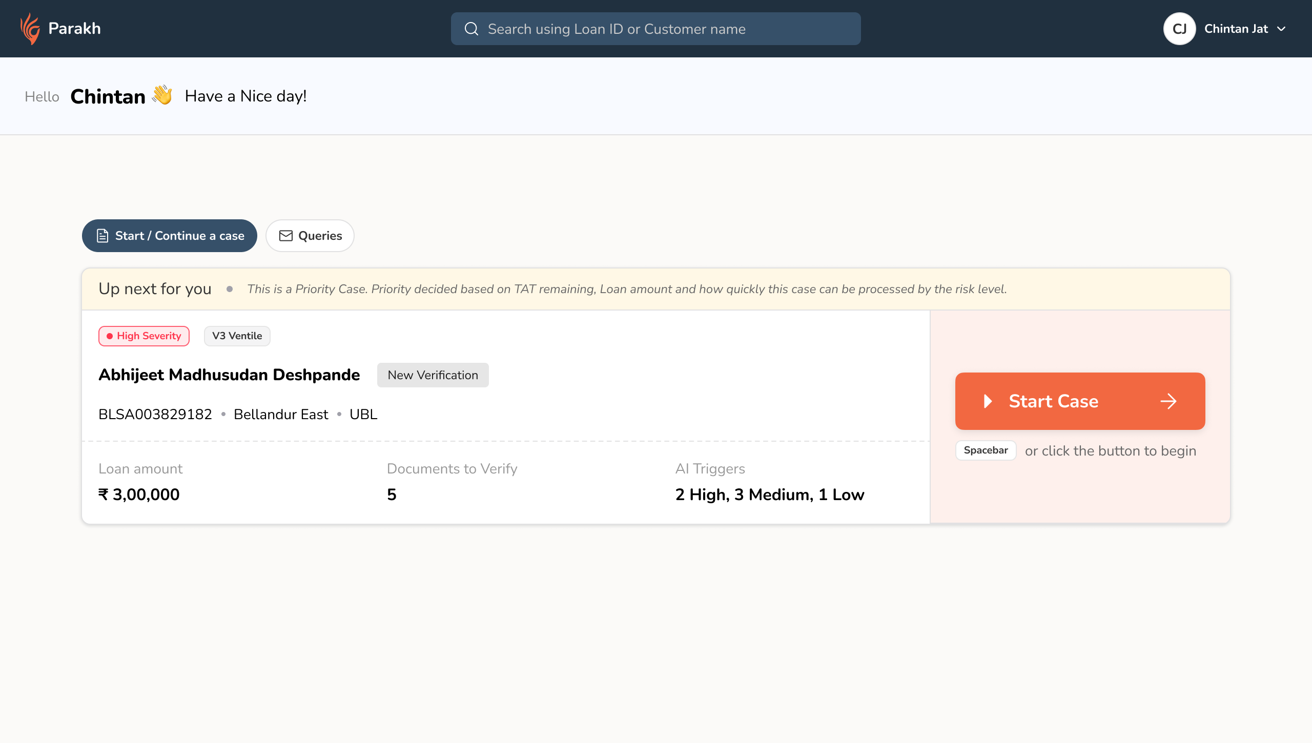
One document. One decision. Nothing else on screen.

Samplers told us the unit of their work isn’t the case it’s the document. A case is just a bag of documents that share a lead ID. So we made the document the whole screen, and validated it with the users. Here are the features that made it to the final cut.

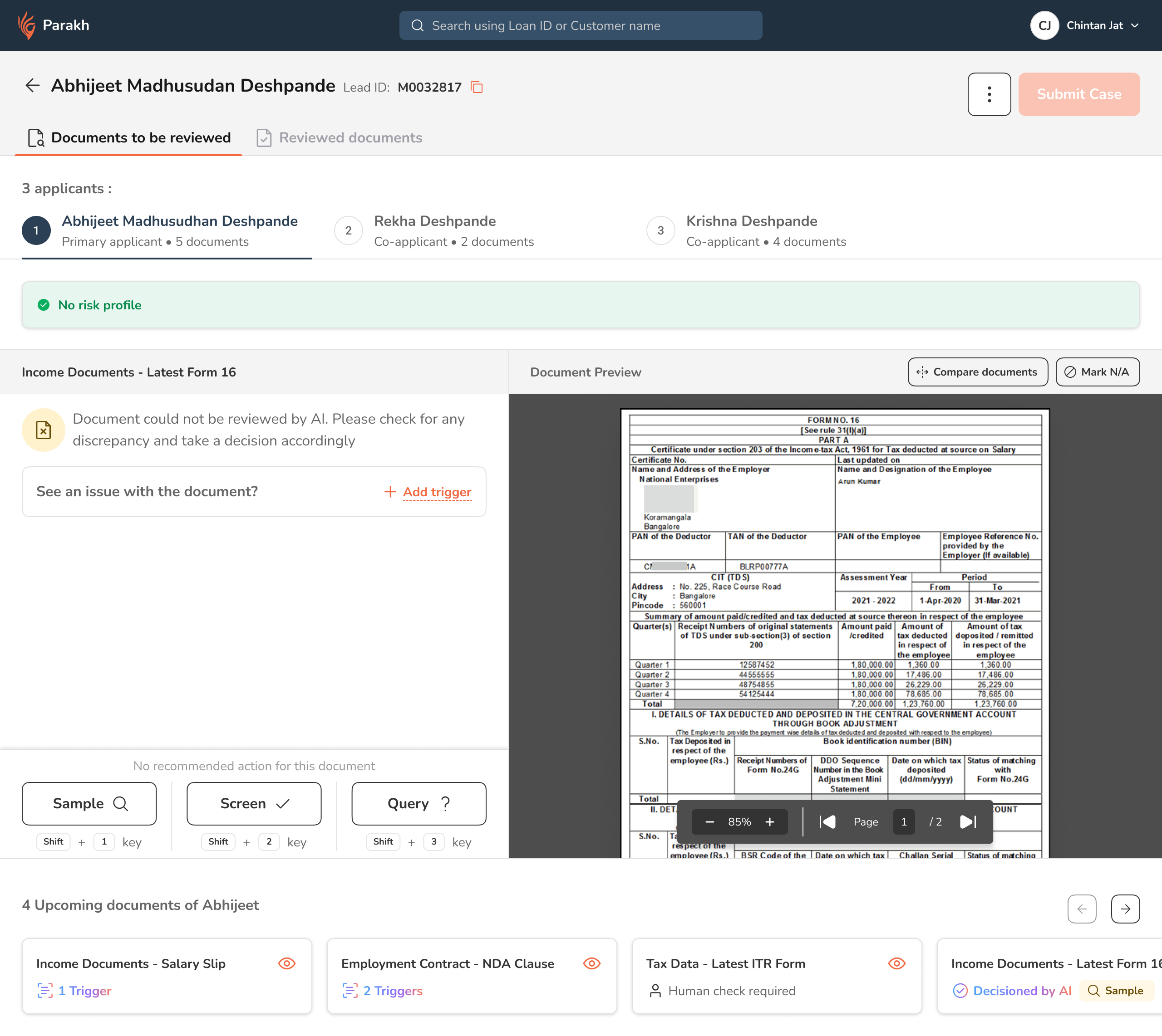
Split viewTriggers on the left, the document itself on the right. Nothing competing.
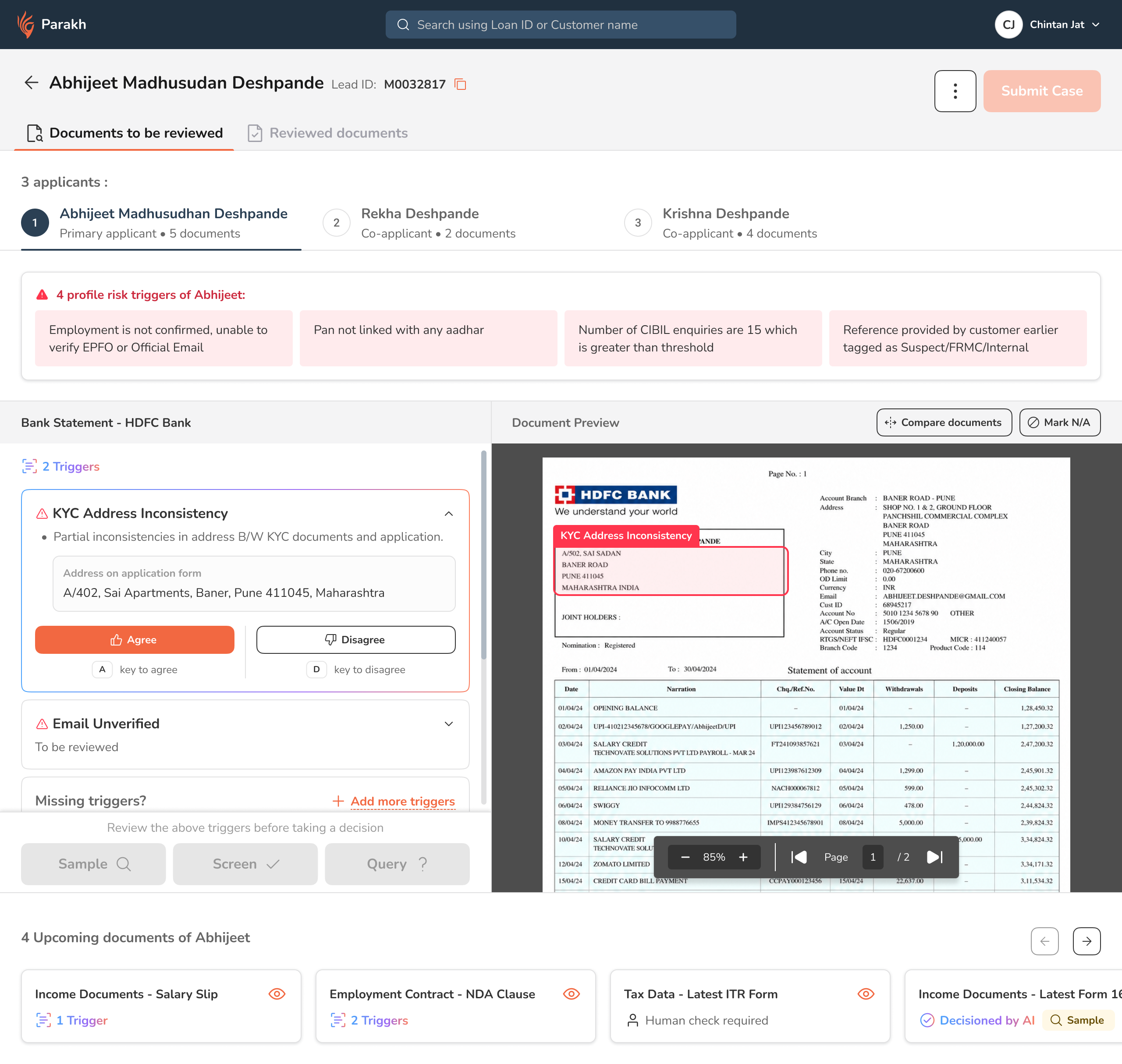
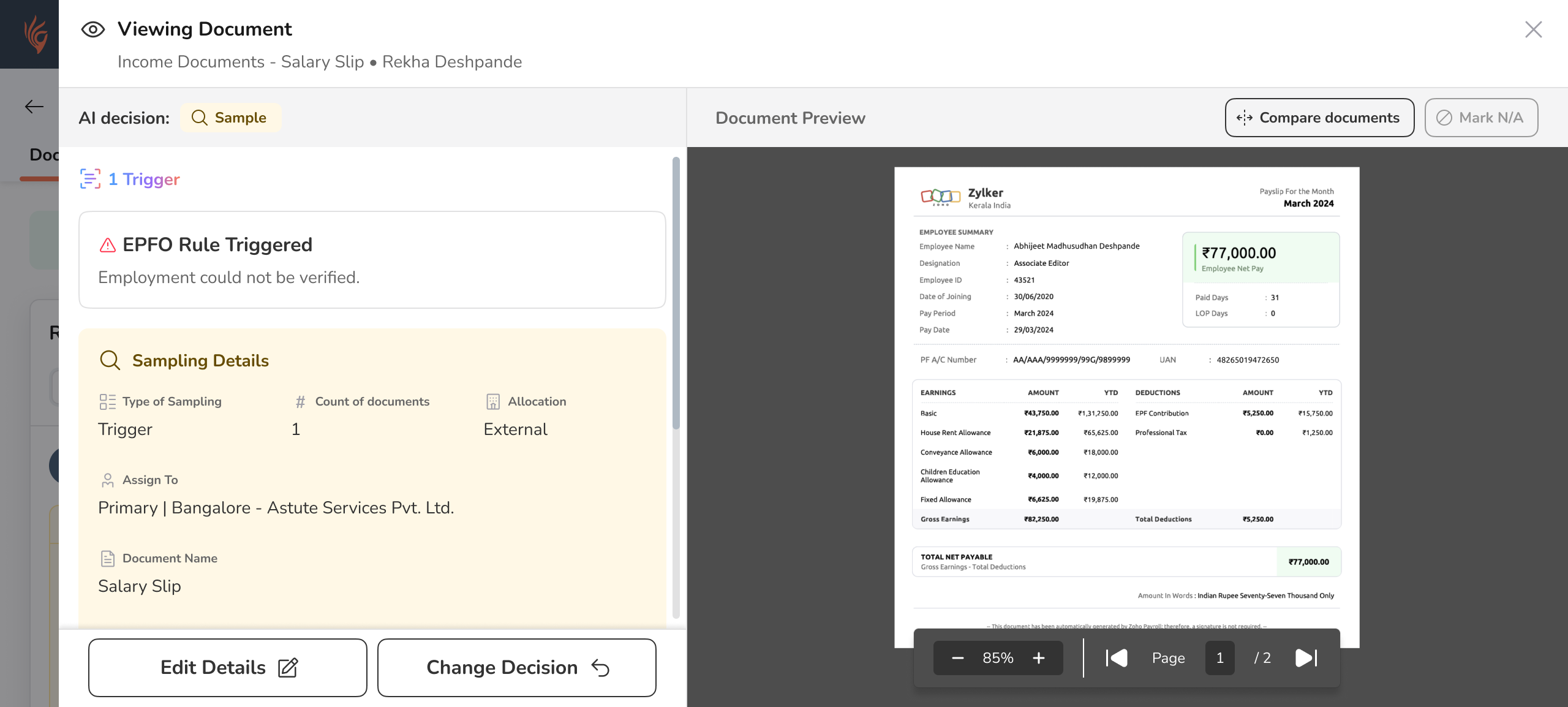
The trigger points at the evidenceClicking a trigger auto-scrolls and zooms the preview to the exact region, and highlights it. The model already knew the coordinates.
Agree / DisagreeThe primary action is a verdict on the model, not the document. Keyboard shortcuts, because it happens hundreds of times a day.
Profile triggers on topThe Leo tab is gone. Applicant-level risk sits above the documents, always in view.
The decision bar stays lockedSample, Screen and Query stay disabled until the triggers above them have been reviewed.
Every AI call stays labelled“Decisioned by AI” is permanent and filterable. Six months on, you can still tell who decided what.

Shipped Gallery

Selected important screens from various flows. Click on a screen to view in full screen

Watch this video to experience the happy flow scenario.
(Psst…it has a voiceover)

Want to get a hang of it yourself?
Try it out in this recreated UI

Click a trigger to see it pointed out on the document. Agree or disagree with each one — the decision bar unlocks only when you’ve dealt with them all. Keyboard A and D work too.

What we’re aiming at

Investigate fewer cases. Catch more fraud.

It’s designed, not shipped so these are the numbers we agreed to be judged on, not results. The shape of the argument is the point: fewer blue squares, more orange ones.

Today

every case reaches a human

Once it’s live

the model routes before anyone opens it

Each square is one case arriving at the fraud unit

Investigated, fraud found Investigated, came back clean Checked at the desk, never investigated Auto-approved, no human opened it
Cases sent for investigationfewer, not more1513
Frauds caught per 100 caseshit rate 13% to 30%~2~4
Cases needing a human at allthe cleanest 5% skip the queue10095

A different question, counted differently

Of 100 frauds that only surfaced after the money went out, how many had been investigated first?

Today23 investigated · 77 went out without one
FY27 target50 investigated · 50 went out without one
Investigated before disbursal Not investigated before disbursal
What I’d watch

Automation bias

The moment a screen says “Recommended”, some fraction of people stop thinking. That’s why the recommendation is a label and never a pre-filled selection. It reduces the effect; it doesn’t remove it. The override rate is the canary if it drops near zero, samplers have stopped reading.

Agree-button fatigue

Keyboard shortcuts make agreeing fast. Fast is good until it becomes reflex. If thumbs-up rates hit 98%, the loop is feeding the model its own opinion back and calling it validation.

What I took from it

Consolidation isn’t simplification

Putting four systems on one screen made things worse before it made them better. The gain came from picking the right unit of work and being ruthless about everything that wasn’t it.

The interesting work is the failure states

Anyone can lay out the happy path where the model is confident and correct. The craft is in what the screen says when it isn’t and making sure a human can always take the wheel back.